

Graphic Design Tips for Screenwriters
Because it seems like they expect a cover image these days...

I will lead with the caveat that as a WGA writer, the idea of any extra work beyond your script is something that you should not have to pay for yourself. The idea of doing cover art is relatively new, we are now in a world where a thumbnail image at the very least is expected by the growing number of tracking lists/boards and pay-for-coverage online sites. I have been doing covers for about 15 years, mostly because I was still a full time designer when I was trying to break in. I was told frequently "you shouldn't do this, but it's awesome so it's okay." In a way, I think that's the first tip:
YOU ARE BETTER OFF WITH NO COVER ART THAN YOU ARE WITH BAD COVER ART.
But, if you must, you must! So to that, here's more tips:
USE FONTS PROPERLY.
I could do nothing but talk about fonts type for hours, but when it comes to a cover image, poster, and key art, there's a couple things above all else to consider. Display fonts are mean for titles, logos, headings, etc.-- anything BIG.
Body copy, (or plain text) fonts are used for reading large pieces of text. Like a book. You don't want to use a display font as body copy, and text fonts used as titles are going to be less impactful. On a script cover, you should use a display text for your title.
If it's simple, you could use it as your byline as well, but often times, that's better suited to a body copy font. If you're adding anything else, like a tagline or contact info, definitely do that as a simpler font. And speaking of simple--
RESIST THE URGE TO USE OVER-STYLIZED TYPE.
I obviously write horror, so of course I have hundreds of crazy stylized "scary" fonts. They have their uses-- but if I use one that is too over the top it not only becomes hard to read, it actually begins to feel unprofessional.
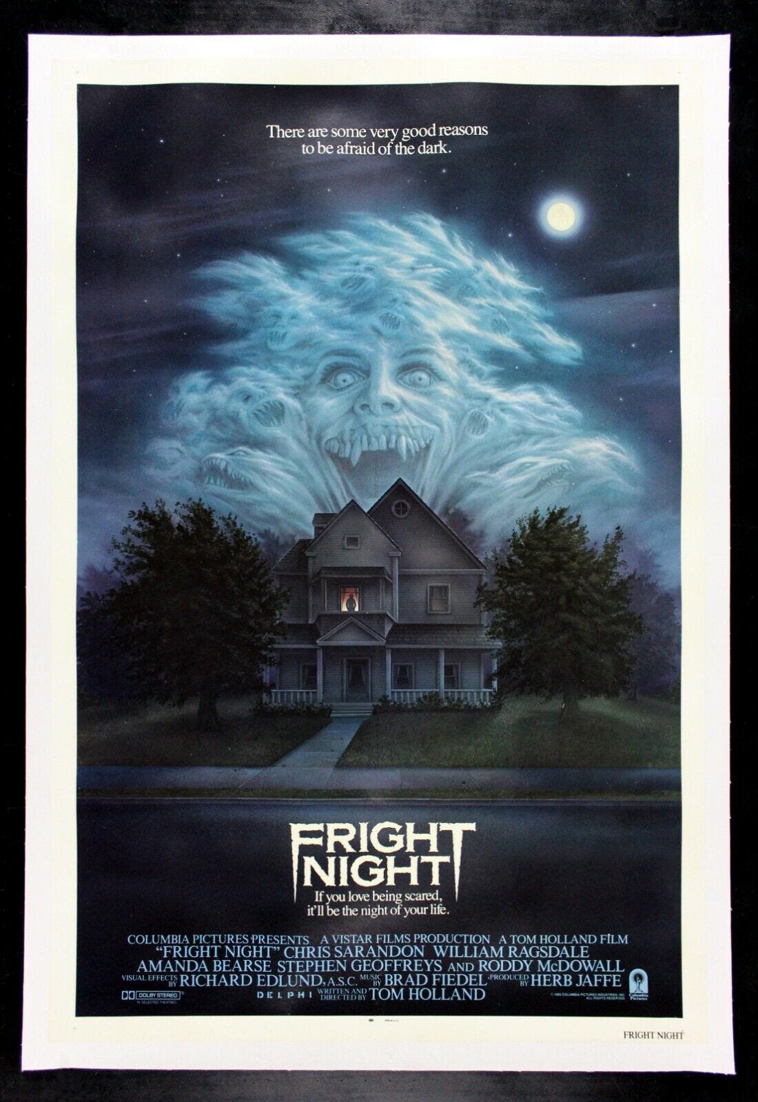
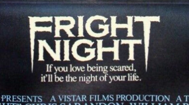
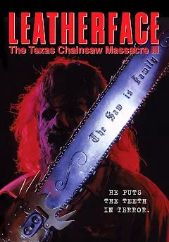
Here's an example. Fright Night is a vampire movie, so choosing a font that's bloody makes some sense. On its own, it's an okay font. But when you place it on the poster a few things happen-- the contrast shows how blocky it is. You see the same letter forms repeated exactly given that I-G-H-T is in both words.
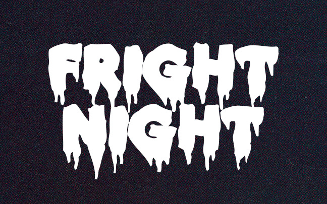
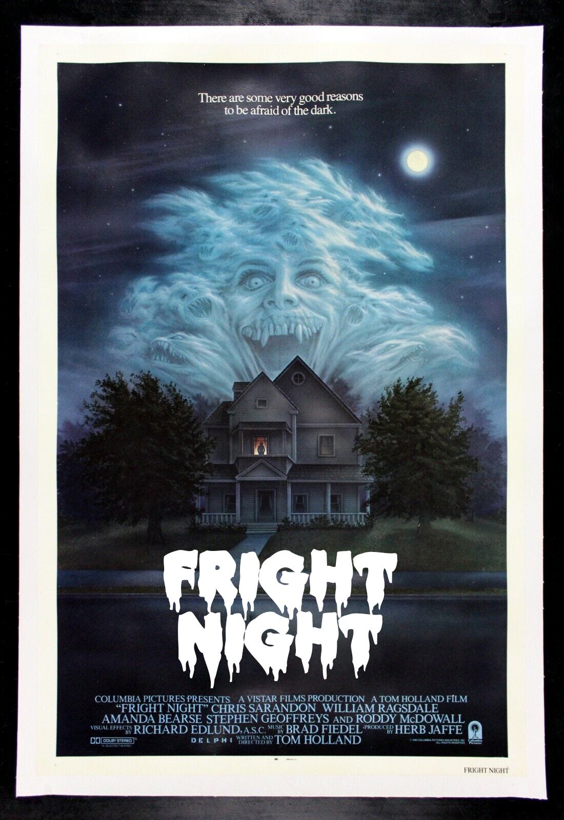
The blockiness begins to fight the other key elements. The more you look t it, it begins to feel wrong because these things keep it from blending in. The actual title is one of the best movie logos ever designed. It uses a very easy to read font, that's given the fang points and roughed up edges. It says scary. It says vampire, but it is still easy to read.
The font TRAJAN, easy to find for free online, is the most used movie poster font. It is easy to read and has simple letterforms that are easy to customize.
Next tip— USE A COMPOSITIONAL MODEL. What does that mean? Graphic design at its core is using key visual strategies to convey information. Information can be anything: pictures, words, logos, vibes… combining these different elements into a cohesive composition is design. Screenwriting has rules about how you to fill a page. We know not to make elements run too long, or make our pages solid blocks of type. We guide the eye by breaking lines. Well-designed compositions do the same thing. There are lots of different models to base compositions on.
The most baseline model is a grid. Think of your cover being divided into regimented sections. Squares, columns, bars, maybe even, maybe not-- as long as they aren't randomly sized, a grid creates a guide to place you elements and direct the eye.
The most common grid style is the "rule of thirds." Photography, and cinematography, have long favored this model so movie posters and key lend themselves to it as well. Your frame is divided into three vertical columns, regardless of width. Example-- these TCM one sheets.
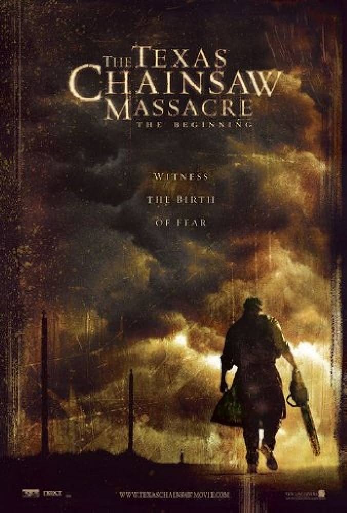
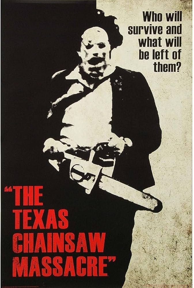
Imagine them each divided into three columns and see the eye is led. Sometimes an element is firmly in one column, sometimes they are on the line. If elements are centered, there will be a diagonal shape to connect them. Words tend to live in one column at a time, or break space in horizontal blocks.
Searching YouTube for "rule of thirds" with "poster design" will give you tons of in-depth explanations. Again, this is just one style, there are others. If you want to be all Drew Struzan about it, look into "the golden ratio."
Next tip: USE COLOR THEORY. If you don't suck at dressing yourself, you know that not all colors work well with each other. There are entire books written on color theory, but for your cover art there's a few things you can learn that will make a huge difference.
You are most likely starting with a main image, either one you've found, or edited together. Whatever editing platform you're using, it should have tools for working with color. You should be able to make the color more intense, dial it back, or remove certain tints. Why do this?
Because it helps with tone. Picture a sidewalk cafe in Paris in the summer. Now think of it in the winter, and it's raining. The differences you're imagining are shifts in the color, lighting, and contrast. season shifts in weather and sunlight make for perceptual shifts.
To work with color well, you to think of two key aspects. Color temperature, and complimentary colors. Temperature is easy-- you got warm colors, reds and yellows. And you have cool colors-- blues and greens. The most eye-pleasing images will live mostly in one space, with smaller pops of the other. When deciding which way to go, just lean into your script’s genre and tone. Sci-fi and horror lean cool, while romcoms and adventures lean warm.
Complimentary color theory is the simple premise that any given color has an opposite. As opposites, these colors together create contrast. The most simple application of this would be to tint your cover image one color, and set your title in the complimentary color for instant pop.
Sports teams LOVE to use complimentary colors-- purple/yellow, blue/orange, you've seen it in practice. An even better way to apply this, is to adjust the color of your key image so it sits in the cool or warm range, and whichever color has the most going on, use its opposite for titles. So how do you find these?
Again, YouTube and Google the terms "color wheel" and "color palettes" and you'll find everything you need to know, and be able to play with different color models to find the right colors.
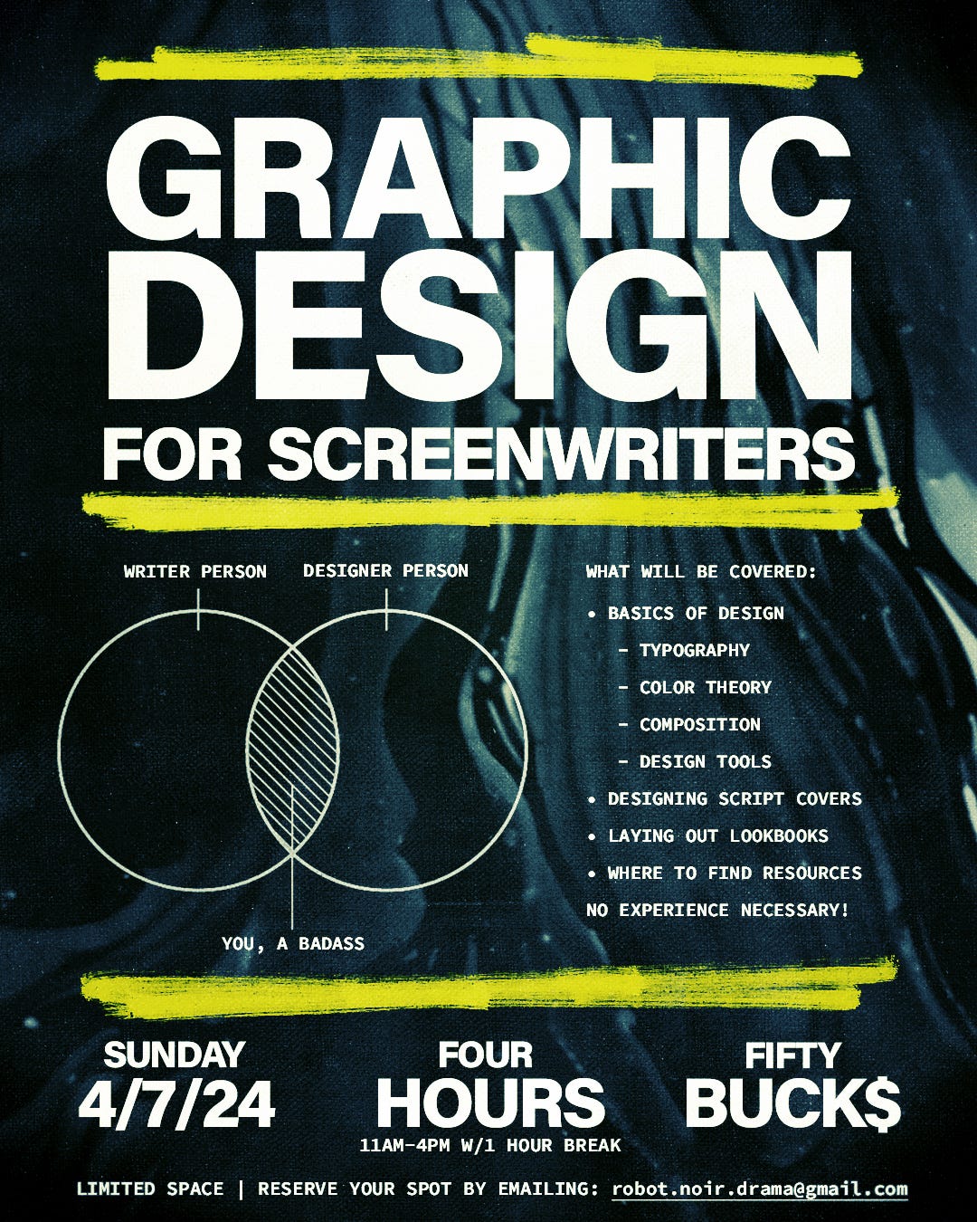
I am just scratching the surface here with the most basic look at these topics, so I have decided to do a bootcamp next month. The info is in the image below! Coming up next: tips for lookbooks!