


As you remember from my last two bits about horror fonts, Benguait and ITC Serif Gothic (Heavy) are the queen and king of horror movie key art. Serif Gothic’s arrival into the horror world came with its use as the primary font used for John Carpenter’s Halloween. This October I decided to rewatch all the Halloween films and I realized something interesting (if you’re a font nerd).
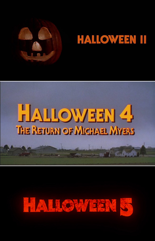
Here is the key art for Halloween, where you can see the font in action. It was used in ALL the marketing for the film. On top of that, it was used for Halloween 2, 4, and 5 as well. See—
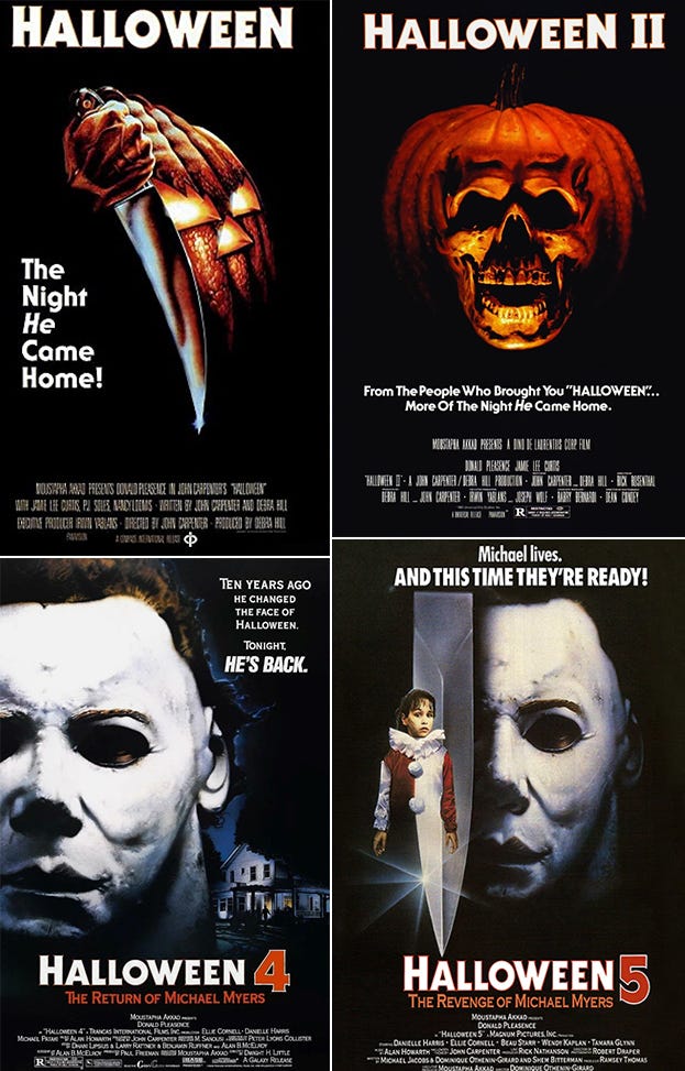
If you’ve got Serif Gothic handy (like I do) you’d notice that the W is not the same font. If you look at the word Halloween in the tagline on the Halloween 2 poster, you’ll see the actual W. It IS kind of a weird W. Somebody in marketing must not have liked it. I THINK the W is actually taken from ITC Avant Guard, a cousin to Serif Gothic.
That said, when you look at the title cards of the later films, they didn’t mind using it save for Halloween 5, which used a heavier version of the font, and made use of the same squared off W.
The font isn’t used in any of the 90s era films because by then Photoshop had changed the game and fonts were out of control. It was brought back for Halloween 2018 and Halloween Kills. Halloween Ends famously uses the same plain font used in Halloween 3. In watching all these movies though, I noticed something only font nerds might notice. Here is the OG title card:
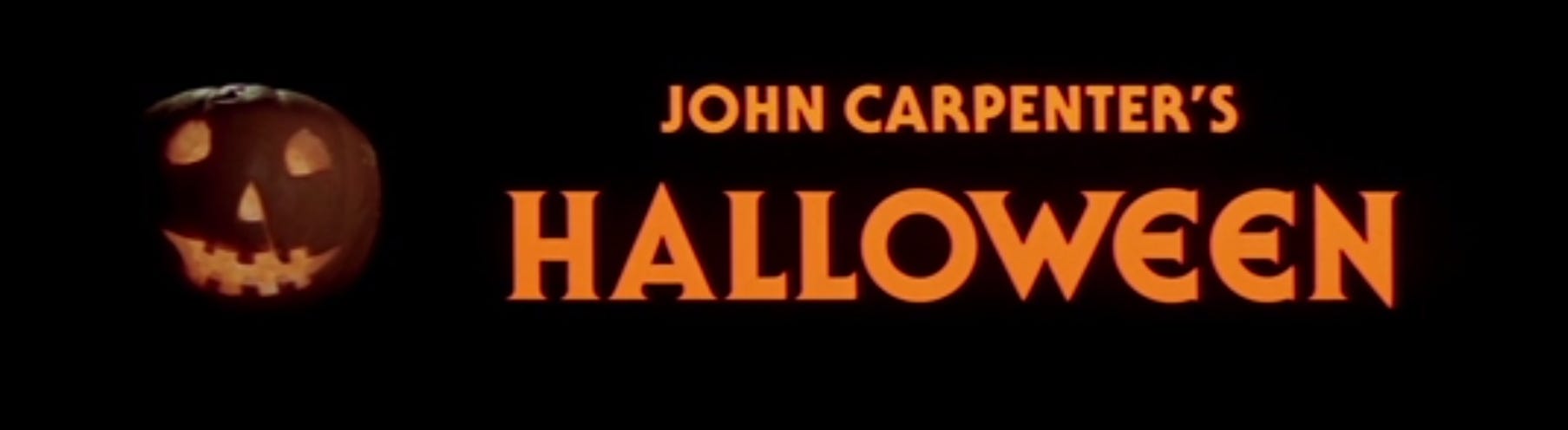
Notice the differences? Obviously, the Es are completely different, the N and the A are pointed instead of squared off, and the W is something entirely different again. The title looks this way in only TWO places. Here, the title card in the original film, and in the 2018 version, which may have just lifted the title from the OG. So what gives? I’M GLAD YOU ASKED!
Pretty much every source naming the font, me included, doesn’t mention the different letters. But, after a bit of Reddit diving, I find somebody who said that the original font had several alternate letter forms. It’s pretty common for fonts to have alts for some letters, along with different weights and widths. I thought this must be the answer to the different letters.
Here’s where I get SUPER font nerdy. The way fonts were managed and implemented once we got past block type in the old west, was that Type Foundries would create large format character sheets that designers would buy multiples of. They would cut these letters out and paste them up onto their art boards, which were then photographed with lithography film for duplication.
In the 50s, these letter sheets could be wet-transferred. Think decals from a model. Get the sheet wet, and a letter slides off for you to place. (Honestly, cut and paste was easier). In 1961 Letraset blew up the design world by creating dry-transfer sheets. Slap it down, rub a pencil over the letter, and it transferred to whatever was underneath. These are still around in art stores.
In the early 80s, foundries had specialized typesetting computer where a “disk” would have dozens of fonts on them. This was completely optical, the disks functioned for or less like a microfiche (ask your parents) and be projected onto photographic paper that would then be used to paste up. It was a throwback method, but allowed for any size to be output.
Obviously, in the early 90s, graphic design went digital and countless old school fonts were turned into digital version to keep up with changing technology. What does this have to do with Halloween? Rumor has it on Reddit, that when ITC created the digital version of Serif Gothic, which proliferates to this day, they did not include the alternate letterforms, and in some cases, made alterations to the original font by squaring off the tops of some letters.
So obviously, I had to go searching for some old Letraset versions of the font and for only $12 on Etsy, scored exactly that:
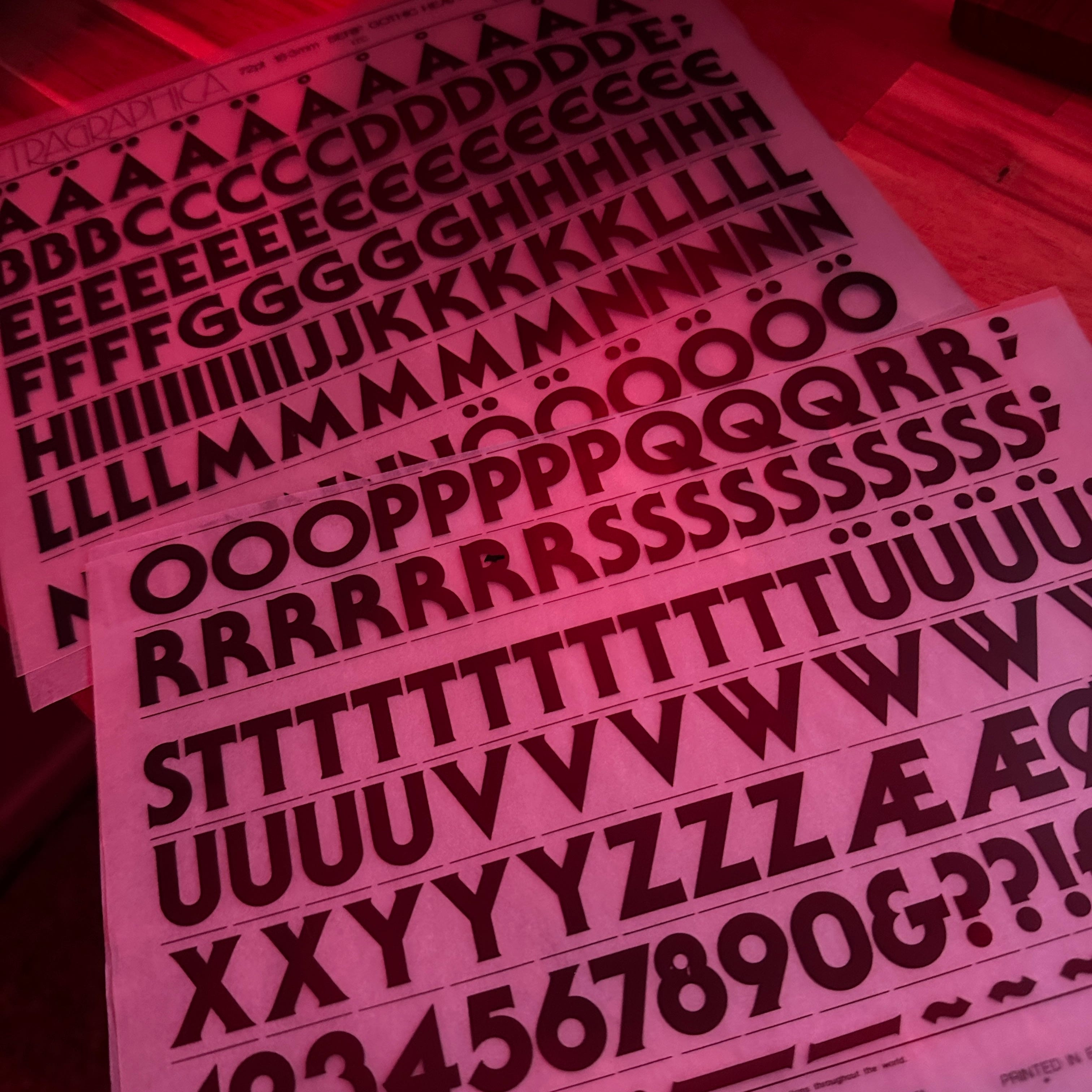
There’s the rounded E, as well as the pointed A and N. The W presented here is the OG wonky version. At first I thought the posters might just be an upside down M, but the angles were all wrong. Assuming that in the 70s, sheets like this was likely what was used to make the title card, it hit me that you could just overlay two Vs and use 3/4 of them on either side.
After scanning these sheets in and doing some tracing and slicing in Photoshop and Illustrator, I was able to properly recreate the OG title card:

As big as a font nerd as I am, I never got into actually making fonts, so if there’s anyone out there with the patience and know how to crack open ITC Serif Gothic and add in the alternate A, E, N and W, let me know, I have them as vector files. See? I told you this was going to be nerdy as shit.
And for funsies, some more samples. Look at all these horror movies using Ruben: