


Remember that time I talked about fonts from old school designers that seemed to be permanently attached to horror movie posters? Well I've got a few more! If you're indie and making your own graphics and wanna be legit, use one of these!
First-- a recap. Without doubt, the Grand Poobah of horror movie one sheet fonts is ITC Serif Gothic, black or extra bold. Designed by Herb Lubalin and Tony DeSpigna in 1972 it was designed for bold advertising headlines. You can spot it in fashion mags from the time.
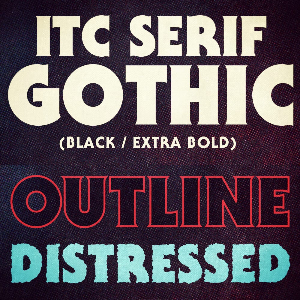
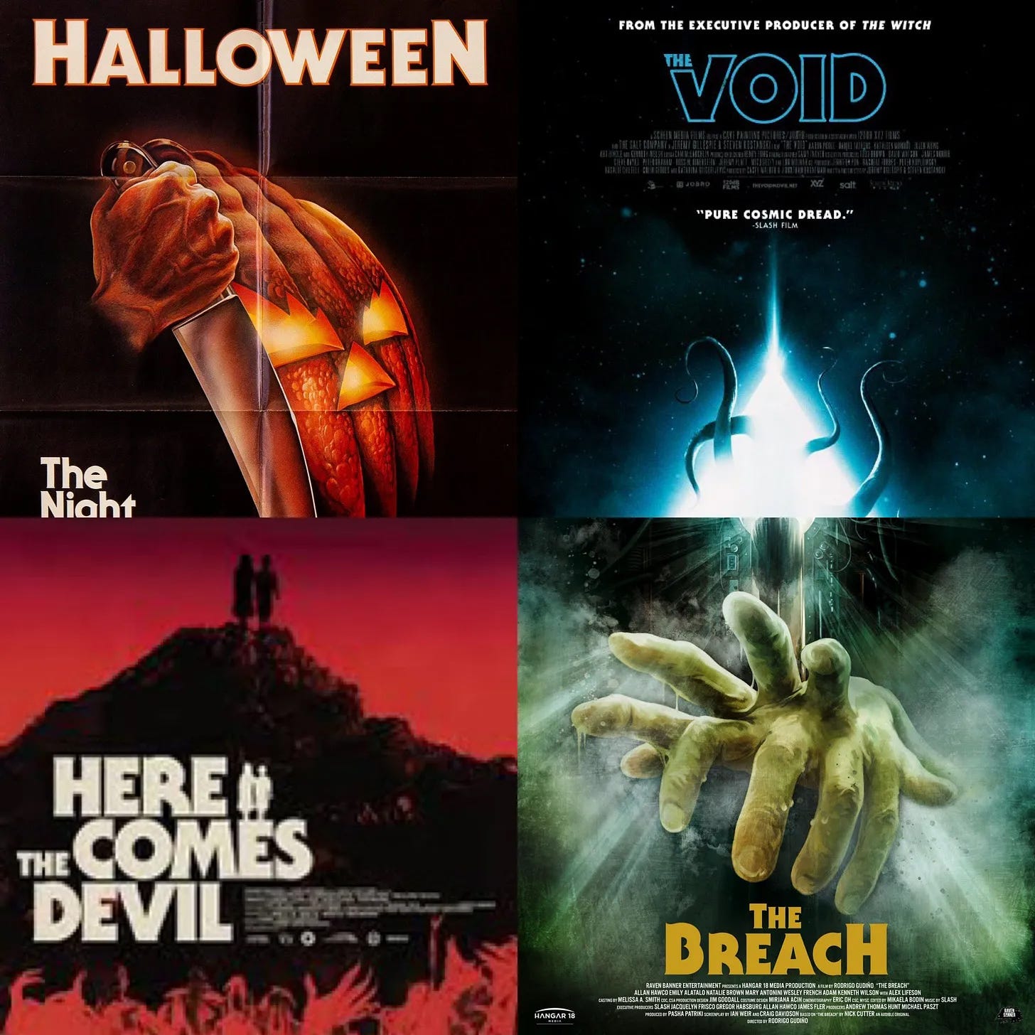
Of course a few years later, it was used on the poster for Halloween, and from then on out, it was associated with horror films and continues to be used regularly to this day. I most recently saw it used for the credits in Kids Vs Aliens.
If Gothic Sans is King, than Benguiat is Queen. While Gothic Sans was blowing up on movie posters, Benguiat was showing up on a lot of book covers moving into the 80s. Being elegant yet bold, it was perfect for grabbing eyes from a distance.
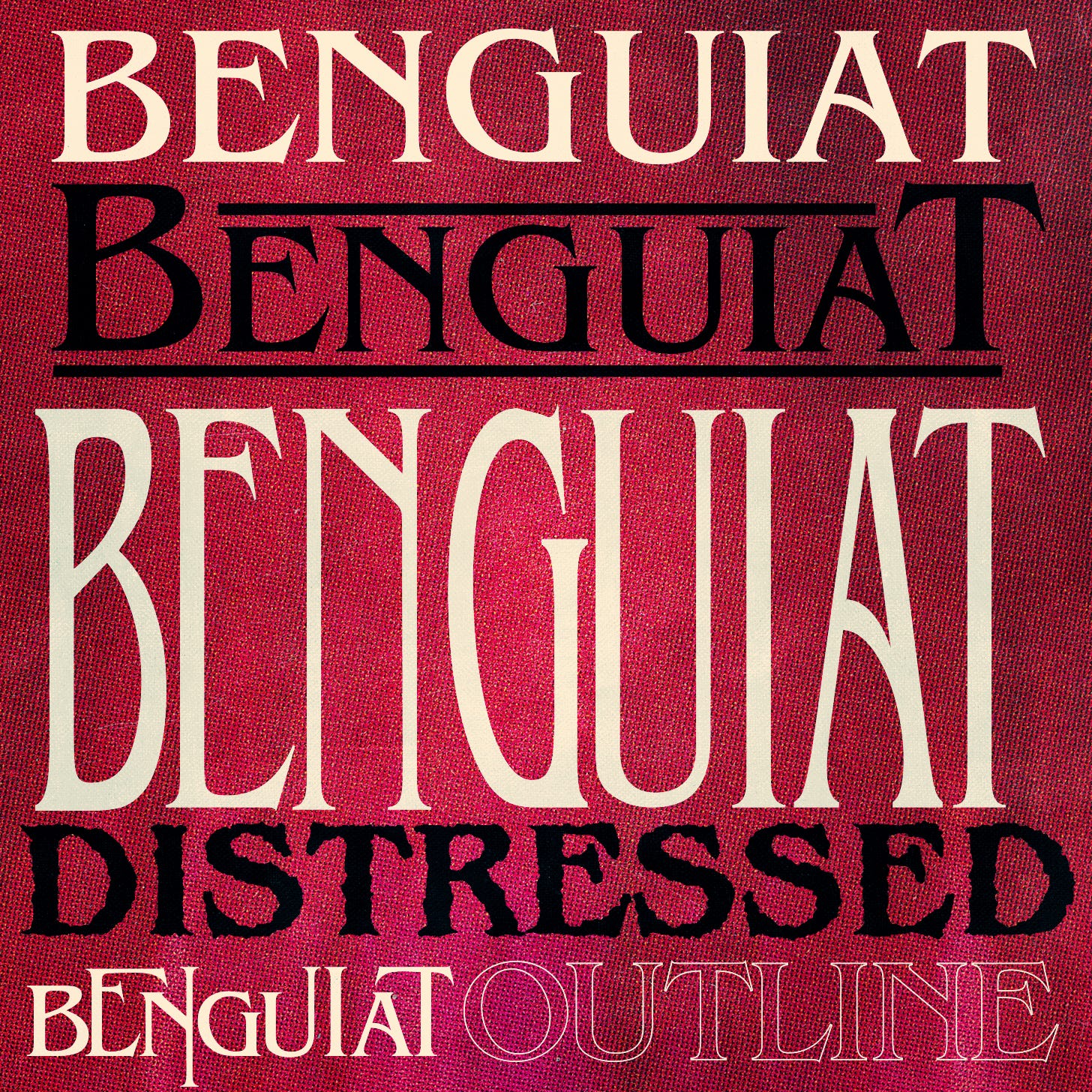
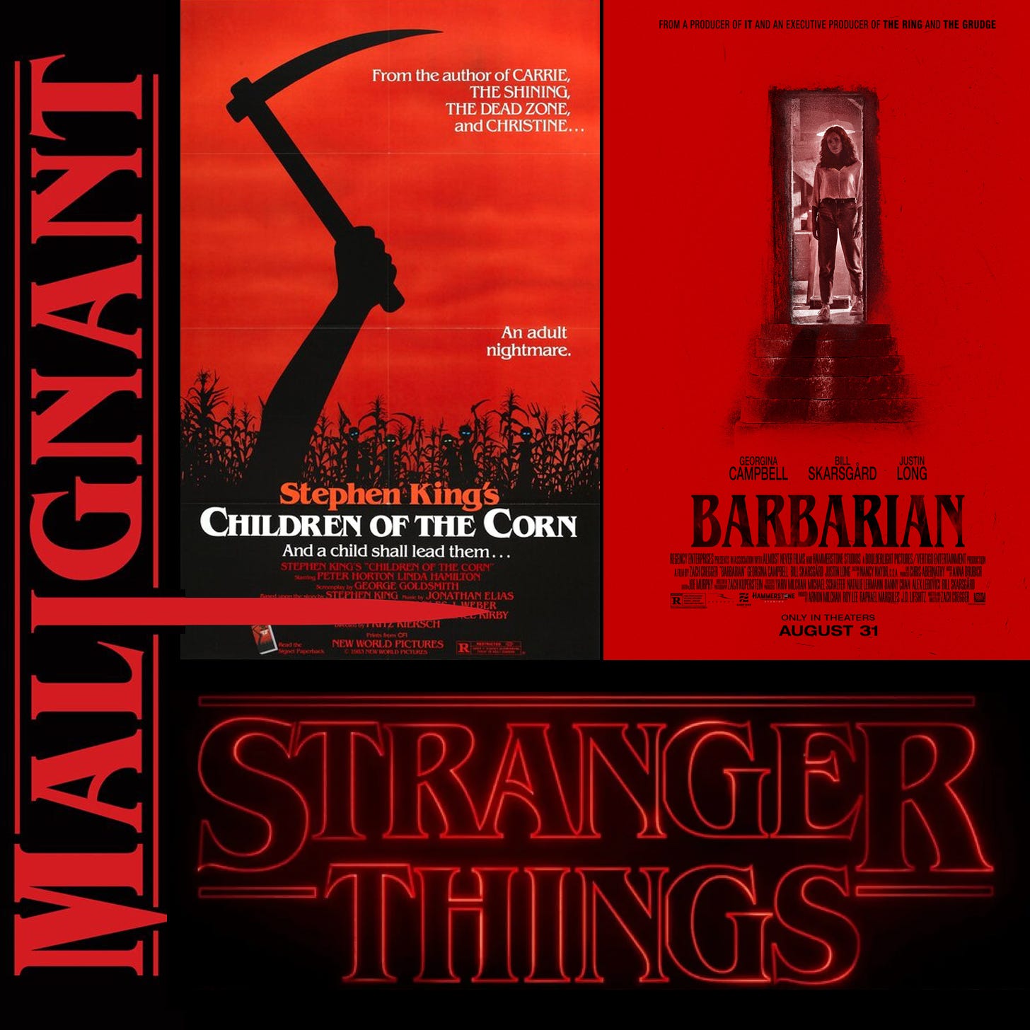
No matter how you customize Benguiat, it manages to keep its balance and flow. It has been used widely in publishing (Stephen King and Choose Your Own Adventure books!) and movie titles (Star Trek used it twice) for decades. Stranger Things has brought it back into use for modern horror.
I used Benguiat on the cover of the Scary Movie Writer's Guide. How was that for a seamless transmission and totally not-gross plugging of my book!? It's a graphic designer treat to look at! Follow the link in my profile grab it.

Sorry, back to fonts...
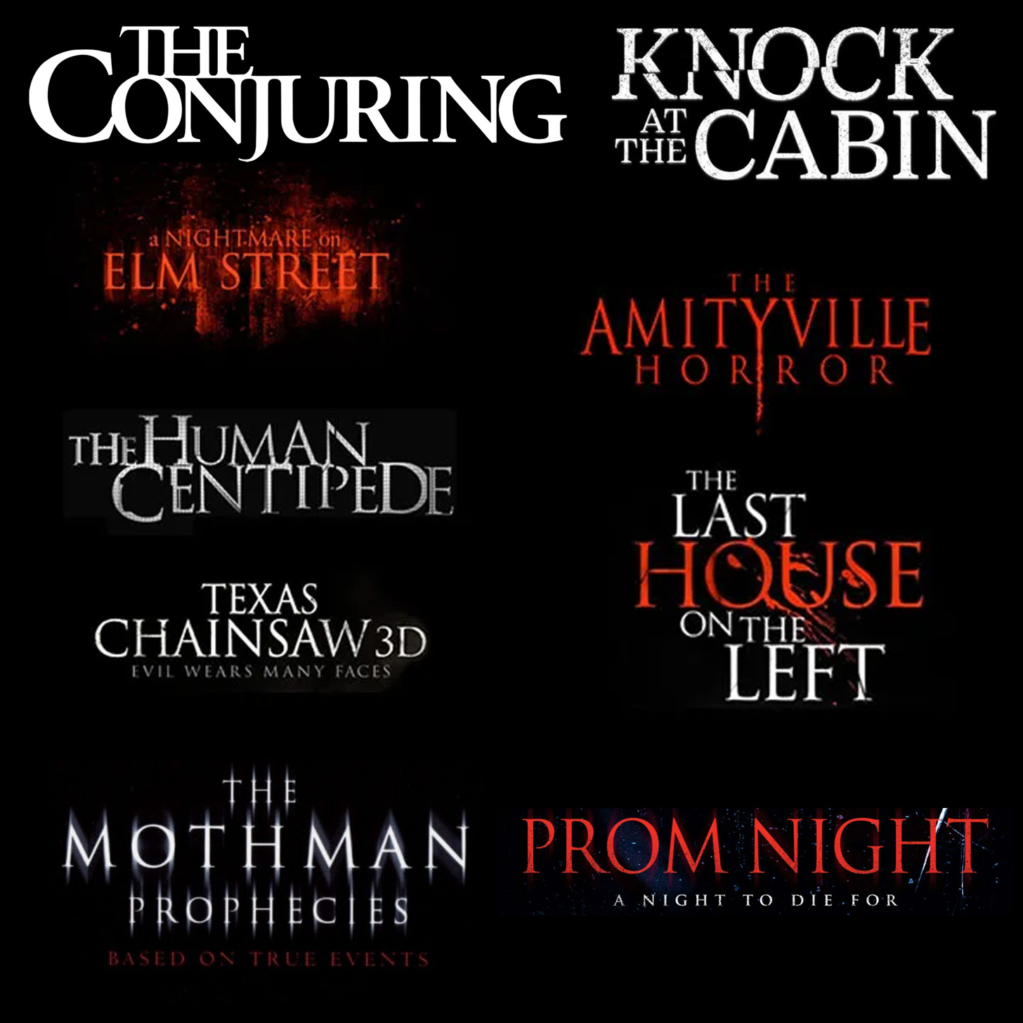
This brings us to Trajan, THE most favored font for movie posters. Not just horror, but across genres. Even Titanic used Trajan on its poster. Based on Roman capital letters and designed by Carol Twombly, it was an early inclusion in Adobe products, which led to its over-use.
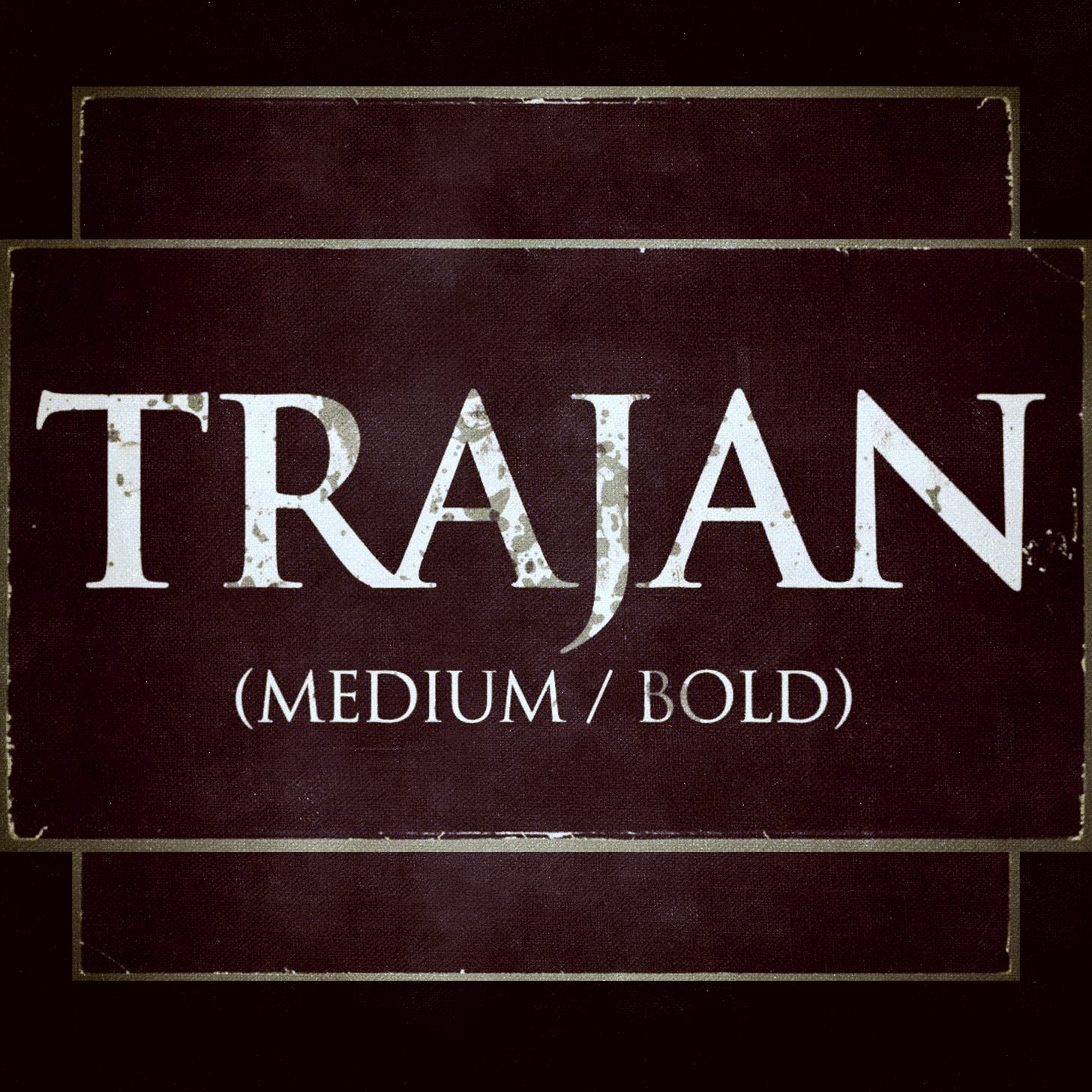
Usually, a horror film will use Trajan as the baseline, but then mix up the letter sizes, extend the descenders and ascenders, or a lot of times you’ll see the letters slightly fractured and cut up. Given that it is a fairly basic font, you gotta make it spooky somehow.
Next, is Ruben. Actually a name used for several fonts, and apologies, but I don't know its history. "Ruben" is probably a modern name given that there at least 3 other fonts using it. Likely a recreation, it's a newer font based on one used at least far back as the 80s.
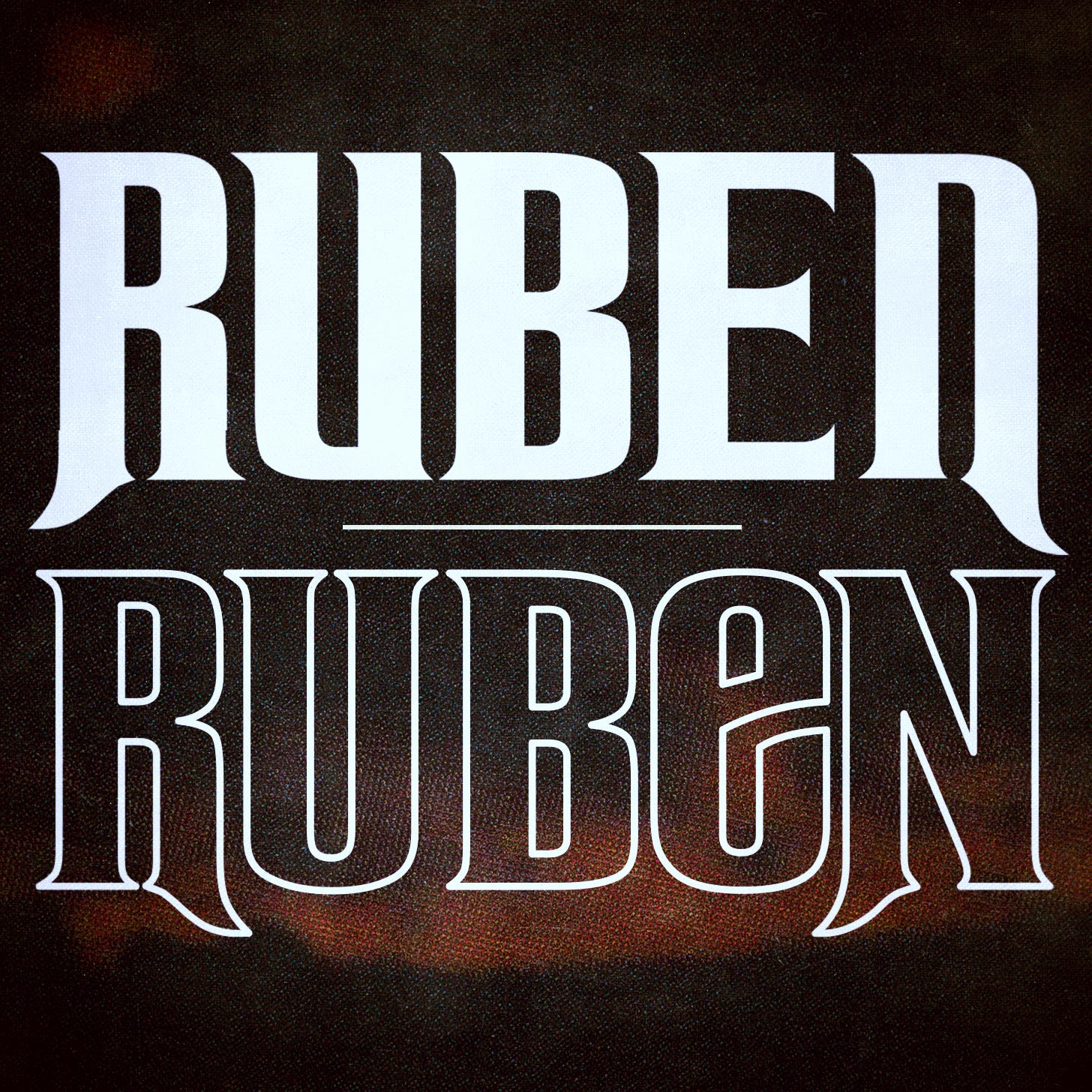
I used to see it on a lot of paperbacks in the 80s and 90s, but of course now, I can't find many samples outside of Black Mirror using it recently. Sometimes called Ravenscroft, a slightly altered version used by Disney-heads as it resembles the Haunted Mansion signage.

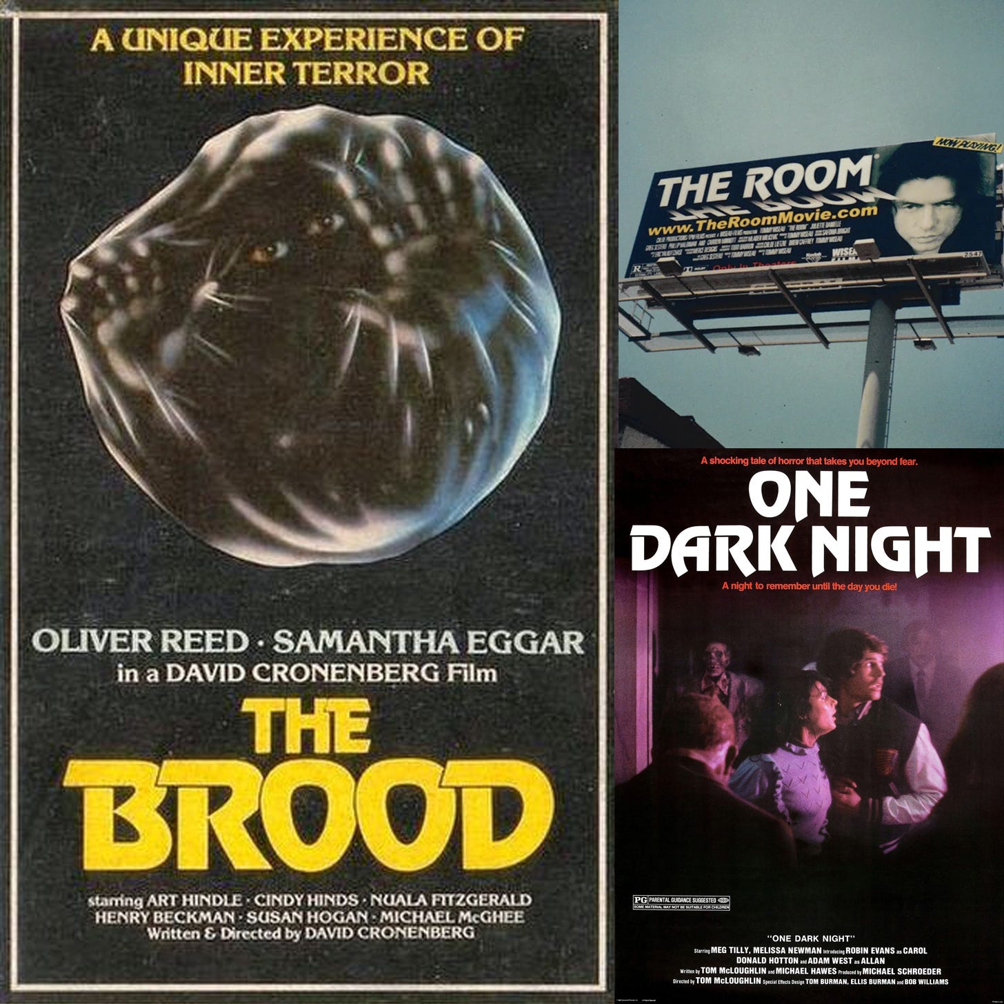
Finally, as a bonus... whilst looking for Benguait samples I spotted this poster for The Brood and realized it's title font, which is called Revue, has shown up quite a few times as well...
Now go forth and font!