Long ago in the before times, when screenwriting was still a pipe dream, I worked in graphic design. I remain a font nerd. Here is a pro tip— from somebody who is a font nerd AND a horror nerd… if you’re making a horror movie title for your script or lookbook, use these fonts!
First ITC Serif Gothic, black or extra bold.
Probably the one used most for mid-budget and indie horror films. It started with Halloween, and pretty much the must used font for horror movies. I most recently saw it used for the credits in Kids Vs Aliens.
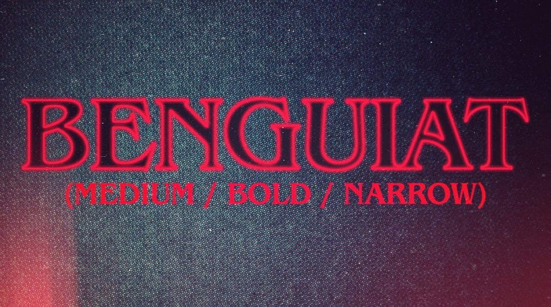
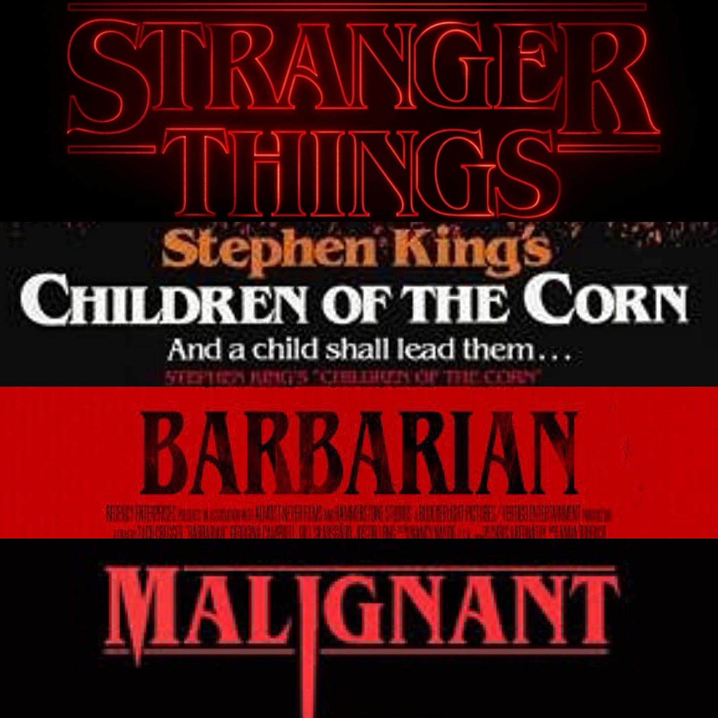
Beguiat was big in the 80s, and brought back into use in modern times by Strange Things. I actually recall it from my Choose Your Own Adventure books.
It’s often referred to as the Stephen King font as his most famous editions of his early books in the 1980s era books used a highly customized heavy bold version of this font. It’s become super popular as of late.
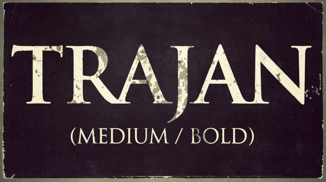
That brings us to TRAJAN.
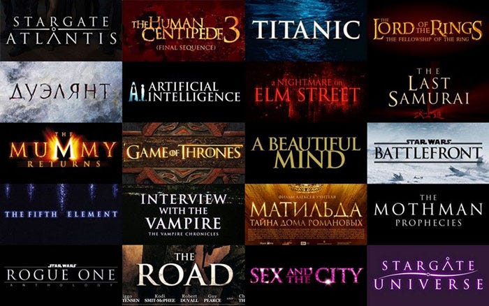
Trajan, for some reason, is THE most favored font for movie posters. Not just horror, but across genres. Even Titanic used Trajan on its poster.
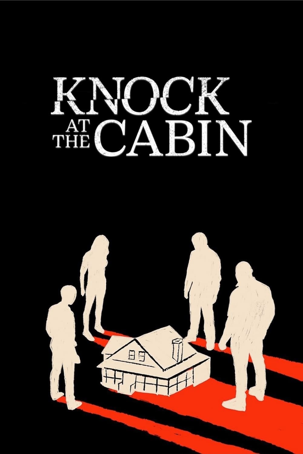
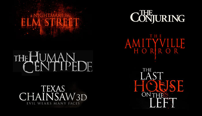
Usually, a horror film will use Trajan as the baseline, but then mix up the letter sizes, extend the descenders and ascenders, or a lot of times you’ll see the letters slightly fractured and cut up.


